March 29th, 2024
Community
Brand Redesign
Throughout the new brand, you'll notice attention to detail in the LogoMark, WordMark, and LogoBug.
The Logotype
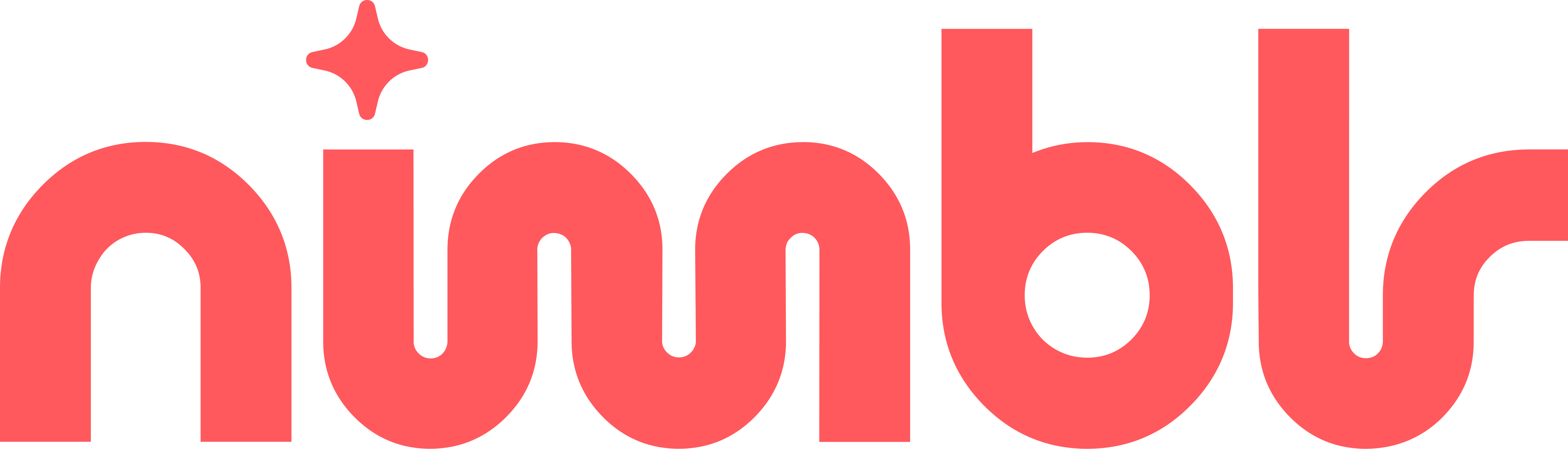
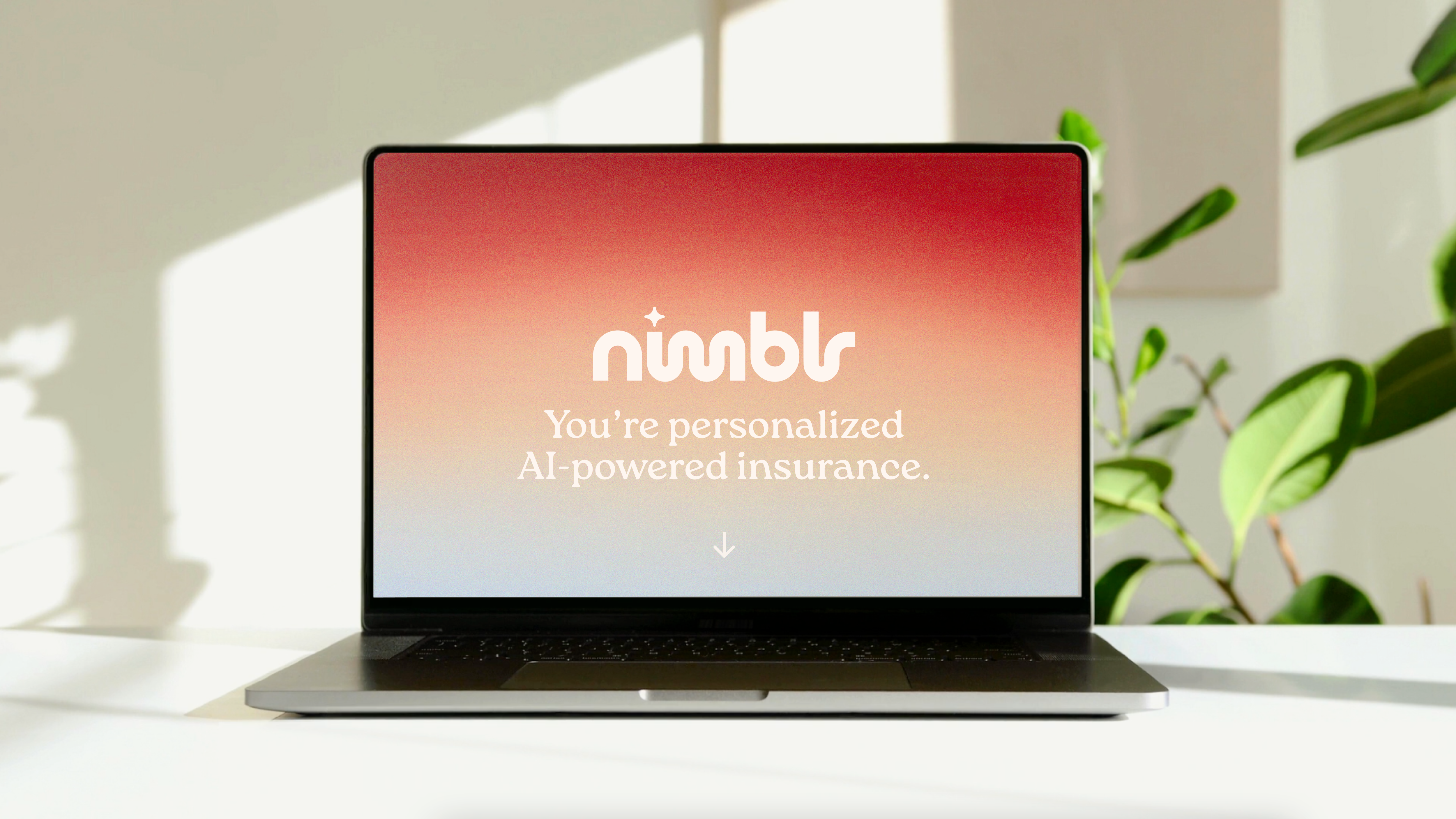
Leaning into Nimblr's blockchain and AI innovation, the logo captures a frictionless, friendly feeling, rounding off the inflexible hard edges that embody the insurance industry. The fluidity of its connected letterforms represent how Nimblr intuitively connects customers with the insurance plan they’re looking for simply and easily. The replacement of the dot above the “i” with a star represents how Nimblr is powered by AI.
The Logomark
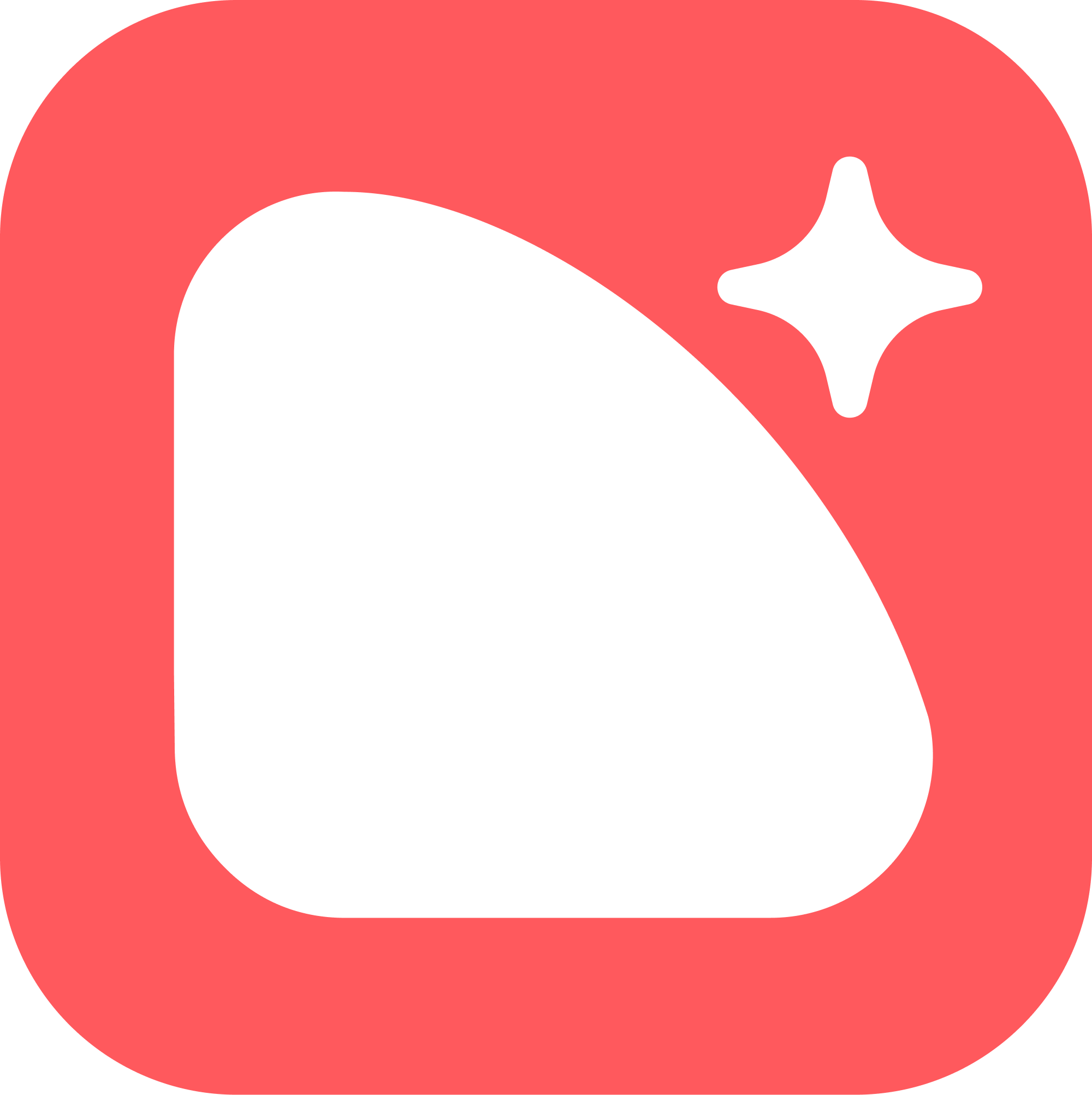
As Nimblr writes the next chapter for the insurance industry – a bright future powered by blockchain and AI – our logomark represents this shift forward as a star rising over the mountain that is insurance
Nimblr Colors
Red is our hero brand color. It brings a sense of brightness, welcoming consumers to the brand.
Cream is used to bring warmth to typography and iconography. Charcoal is used for buttons and type on light backgrounds.